Document Global is an agency that works with pre-eminent image makers and creatives across fashion, art & culture. For their official launch I created two reels to showcase the work to date. The first was designed to sit on their landing page and predominately utilises still images. The second is a video focused overview of the featured contributors’ work.
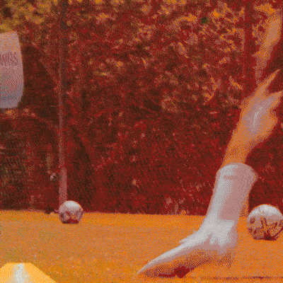
Instagram Story created for the recent ‘Ready Pack’ Nike Football Campaign, with England footballers Foden and Rashford. Supplied with the video edit, my role was to create and apply the hand-drawn scribble GFX onto the edit, as well as animating the ‘Ready Pack’ text lockup, and creating engaging animated visuals with the Swoosh device.
Short self-initiated animation I created to accompany the track ‘Spruce Tops – Bibio’, experimenting with some new visual techniques.
While working with BrandOpus on the new Jell-O rebrand, I was tasked with animating the new logo wordmark and developing the wider motion principles; exploring how text, graphics & patterns come to life, embracing the energetic and playful essence of the brand.
I also worked on a short launch film to showcase the refreshed brand identity, with 3D assets created by Matteo Del Nero.
Document Journal is an independent culture, arts and fashion magazine founded in New York. I was asked by them to explore how their logo wordmark could be brought to life as a simple animated introduction to video content. These are a selection of my proposed approaches.
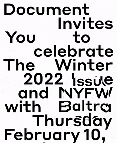
Document Journal is an independent culture, arts, and fashion magazine founded in New York. I was asked to produce an email invite for their New York fashion Week event where they were releasing their Winter ’22 issue. I wanted to create something that would convey the information simply but unexpectedly. I drew inspiration from old Windows95 screensavers; the first two videos were earlier experiments and the third is the final design.
Rooted in the idea of doing things ‘with heart & soul’; the Cathedral City rebrand was centred around a dedication to craft.
Working with BrandOpus, I created a new animated identity and wider motion assets – working on a brand film and producing content for socials, web application and developing a suite of characters that could be used across different platforms.
Block screen-print style illustrations were transformed into a handmade and crafted motion approach that would communicate the human essence and warmth of the brand. The sweeping transitions & reveals in the identity animation and brand assets are a nod to these hand-crafted processes.
This illustration was commissioned for the bottle label of ‘Hut’, a new rum brand. The client wanted to capture a sense of exploration based on their own worldly experiences. My approach was to create an illustration that naturally draws in the viewer, allowing their eye to travel through the vibrant depths of a caribbean landscape.
While at Glamcult Studio in Amsterdam, I was tasked with producing an identity for a new Asian street food restaurant ‘Blauwe Draak’. Whilst drawing inspiration from traditional Asian food market signage, the identity takes a contemporary approach, utilising a dynamic, bespoke wordmark which can be employed both horizontally and vertically. The clean, balanced design combines with more raw material finishes to subtly acknowledge the restaurant’s street food origins.
Document Journal is an independent culture, arts & fashion magazine founded in New York. I was asked to create an animation for their socials to promote the release of issue no.21 and provide an engaging overview of the inside content.
Glamcult Studio in Amsterdam, asked me to develop a versatile typography theme for issue #124 of their quarterly fashion, art & music magazine, titled ‘Modern Love’. My concept was to create a raw, hand-drawn, human aesthetic – drawing inspiration from the ‘passionate’ writing you might find scrawled on public bathroom walls.
Feeld, Document & fashion designer Ludovic De Saint Sernin threw a collaborative party in New York to celebrate pride, and the LdSS SS24 runway show. I was asked to produce the visuals for the venue’s 10ft LED screen to accompany the DJ’s.
Taking inspiration from 90’s screensavers for the logo animations, I used a glitched, distorted aesthetic, while also incorporating the pride rainbow colours, to create an engaging backdrop for the party. I also utilised footage from the LdSS runway show to create an edit – creating abstract visuals from the existing footage while also highlighting the key looks.
Working with B&B Studio, a partner and I were tasked with creating the full suite of illustrations for the new rebrand of Belvoir drinks. Following this, I was then asked to animate the new Belvoir Farm wordmark and explore how the new illustrations would come to life through motion across socials and other digital touch points.
While at Glamcult Studio in Amsterdam, I was asked to develop a typography theme for issue #123 of their quarterly fashion, art & music magazine. This issue explored fluid conceptions of the human body. My concept was to combine widely contrasting type weights to visually reference the idea of diversity and non-conformity.
On-screen GFX created for Rajn – ‘Against the Wall’ music video, directed by Quinn Lovero. For this project I was commissioned to create an imaginary 80’s inspired video game based on the track title. In the video the artist sits playing the game before he starts hallucinating and the game’s character begins to communicate with him through the screen, pulling him into a psychedelic world.
This design was conceived for the nightclub ‘Tape London’ to promote its weekly DJ event on social media. Whilst keeping the text clean and legible the design utilises an eye-catching animation to ensure the piece cuts through within a visually crowded environment.
Created as a self-initiated project, I wanted to examine how modern technologies could be used to re-imagine existing pieces of design. Sonic Youth is a band I was drawn to due to their experimental and innovative nature and I decided to re-imagine their album artworks through 3D – producing both animated visuals for digital use and still imagery for the printed elements.
The first design, for the album ‘EVOL’, portrays the album’s recurring theme of the glamorisation of death, as well as referencing a statement from the band claiming the album hoped to ‘Expose the dark underbelly of American pop culture’.
With the second design, for the album ‘Sister’, I wanted to visualise the idea of ‘looking through a different lens’ – taking new angles and approaches towards existing methods and standards, reflecting the nature of Sonic Youth’s music.
The design for the album ‘Washing Machine’ was created to reference the idea of the ‘structure within the chaos’ – producing a disorderly glitching aesthetic, challenging legibility and embracing elements of error.
The Molson Brewery is based in Montreal. It produces the majority of Canada’s top selling beers and is a prominent sponsor of the National Hockey League. While working with BrandOpus, I was tasked with creating an animated identity and the motion principles for the new Molson rebrand. From the brand’s recognisable hexagon motif, a flexible ‘mosaic’ identity was created which can be utilised in diverse patterns and transitions across different touch points.
Glamcult Studio in Amsterdam asked me to produce a series of illustrations for the bespoke shirt brand ‘Shirt By Hand’; to highlight key aspects of the services they offer. These were used across digital and printed mediums.
Animated Christmas card produced for BrandOpus design agency.
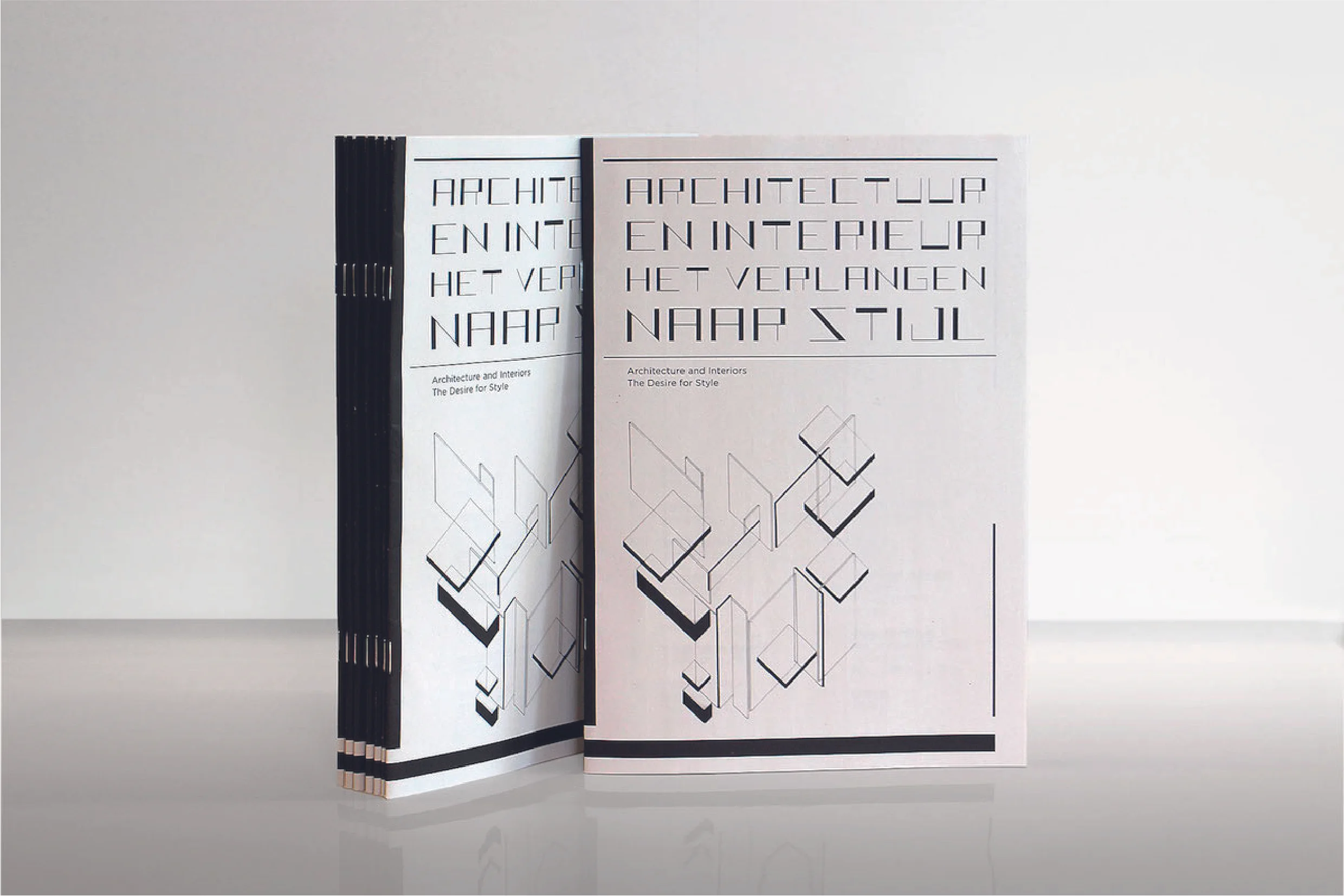
Glamcult Studio asked me to produce a bespoke typeface for use in the catalogue for an upcoming exhibition in The Hague, celebrating the progressive thinkers of the Dutch movement ‘De Stijl’. My typeface is inspired by the key principles that defined the work of these famed designers and architects.
Glamcult Studio, Amsterdam, tasked me with designing an identity for ‘Hen & Eggs’, a unique new restaurant opening up in the South of the city, serving solely chicken and egg based dishes.
Using a loose, hand-drawn aesthetic to reflect the simple nature of the food; the logo was created by incorporating an egg shape into the illustration of a chicken’s head, thereby visualising the namesake of the restaurant.
Additional visuals demonstrated how the chicken and egg elements could be used as a flexible theme throughout the identity – as patterns and shapes across different applications.
Document Global is a creative and advertising agency that works with pre-eminent image makers and creatives across fashion, art & culture. I was asked to create an animated interpretation of their identity to be used across digital touch points. I also produced three social posts to promote the launch of the agency and their newly designed logo wordmark.
I was asked by director Florence Kosky to produce a poster for her short film ‘All the World’s a Stage’ starring Olivia Colman.
‘All The World's A Stage is about an actor who loses his sense of identity and feels he can no longer perform. Due to this loss, he decides to quit the play he is the star of - with devastating consequences.’
The poster utilises a bold and vibrant illustration to catch the viewer’s eye and references a key scene within the film.
I was approached to produce a poster for the film ‘Blue Elephant’ by Matt Flack at the end of his MA Screenwriting course when students pitch their scripts to an audience of industry professionals. Blue Elephant is a dark comedy which follows a group of petty criminals on a road trip from Arizona to New Mexico to perform a Hindu Burial, all the while being pursued by a gang of hired goons.
While working at BrandOpus I was tasked with animating the new identity for Vitalite, a sunflower oil based spread. The animation reflects the brand’s playful, hand-made aesthetic and champions the positivity of the sunshine symbol that has long been associated with the brand.